The saying that design can make or break your product is not an exaggeration. The numbers speak for themselves — 50% of consumers believe that a company’s website is crucial to their opinion of the brand. In addition, businesses that embrace design showed 32% higher revenue growth.
A lot goes into crafting great design. One key element is user interface (UI) that is focused on the look and feel of a product or a solution. UI encompasses a combination of typography, animations, imagery, color palette, buttons and more to make interaction with a solution as pleasant and intuitive as possible. Another area is user experience (UX) that focuses on a user’s journey and aims to ensure that a user can accomplish the desired task quickly and easily.
Both UX and UI are important as poor navigation, confusing onboarding flows, visually unappealing interfaces, and even irrelevant copy can demotivate users and kill conversions. In this article, we aim to provide you with a UX/UI design toolbox packed with best principles that can help build a modern, highly engaging solution that users love.
As the name suggests, scrollytelling combines storytelling and scrolling to create memorable user experiences. This is a technique where with each scroll different UI elements — images, snippets of text, fonts — come to life. No clicks, no pop-ups, just a gradually unfolding story that users actually want to read.
Scrollytelling can help turn even boring instructions into an engaging experience. Just look how Google has leveraged this method to explain how search works in a fun and dynamic way.
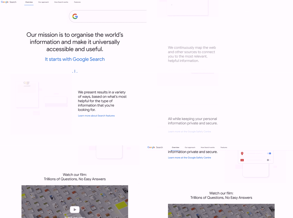
Source: Google
There are some things that will never go out of fashion, and minimalism is definitely one of them. Clean, fresh, and uncluttered design is what makes a message really stand out. Fewer decorative elements, colors, pop-up windows reduce distractions and decrease the cognitive load, helping users better focus on their task at hand. Tech leaders like Apple, Meta, Revolut, and others are well-known for their minimalistic yet powerful designs.

Source: Revolut
An integral part of any UX/UI design, micro-interactions are small functions that allow users to accomplish a single task. Likes and shares on Facebook, a “Skip intro” button on Netflix or even a snooze button on your alarm — these are all examples of micro-interactions tightly woven into product design. These tiny details have a huge impact on a user experience as they provide instant visual feedback to keep users informed.
There are different types of micro-interactions that can help make user experiences more rewarding — mouse hover effects, swipe/slide, data input and progress, tap and click, and more. And given the visual nature of users, designers can incorporate functional micro-animations to drive better engagement.

Source: UXdesign
In recent years, the development of technology has made 3D graphics more accessible, pushing it to the forefront of web design. From advanced animations to graphic elements to immersive illustrations, the 3D design brings a new level of excitement and enables more engaging and interactive user experiences.
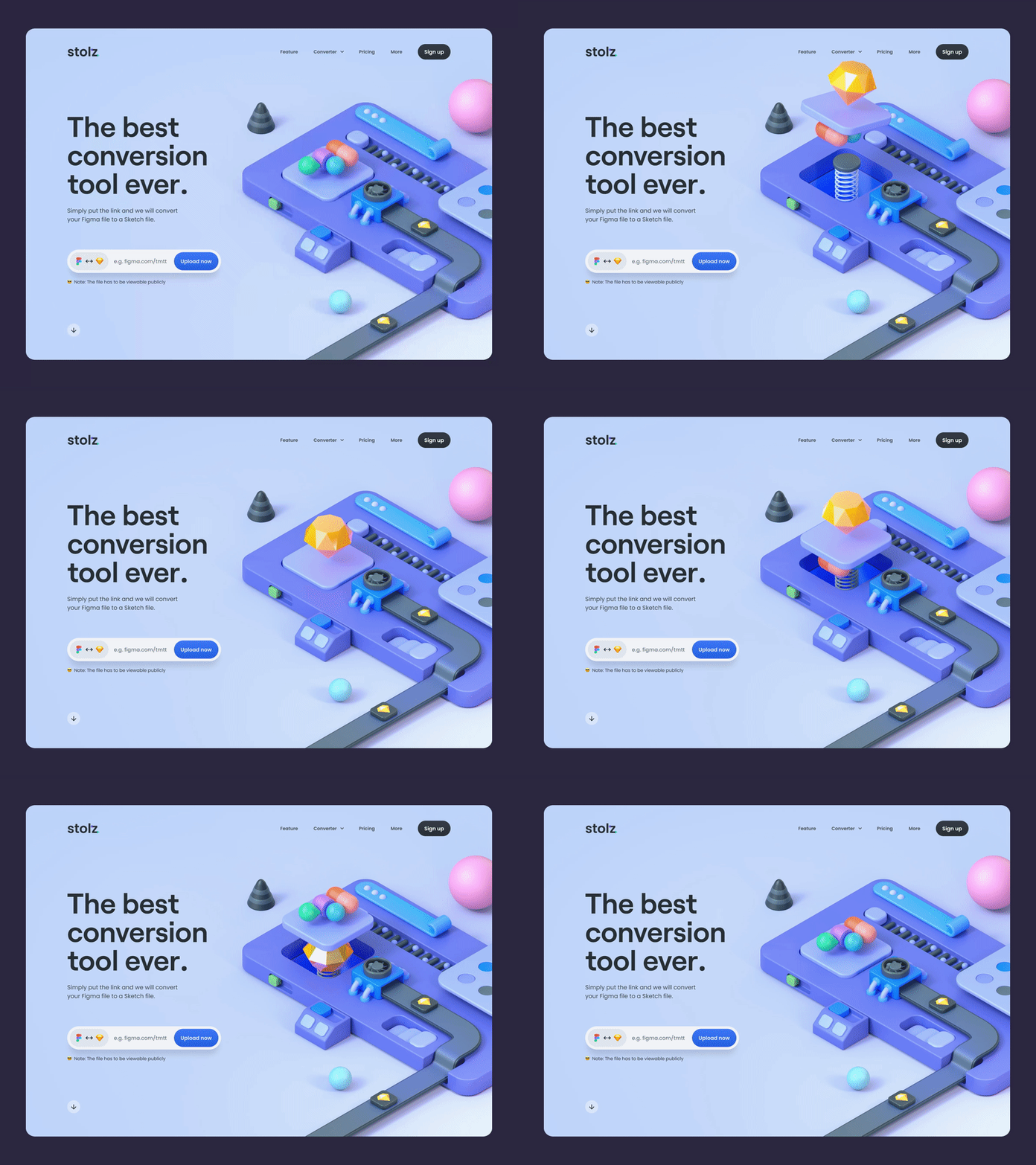
Source: Wandr
Companies that want to add an interesting twist to their online branding, use 3D animations in their logos. Dynamic animated logos are a great way to capture users`attention while also demonstrating brand history or even values.
An important part of a user experience is to be able to make sense of large amounts of data quickly. And since over 65% of people are visual learners, it’s crucial to ensure that data you want to share is simple and easy to understand.
Essentially, data visualization is all about representing complex datasets with the help of visual means. It helps convey the right message in an interactive way. You can use charts, graphs, infographics, images and even animations to present your information creatively without increasing the cognitive load for users.
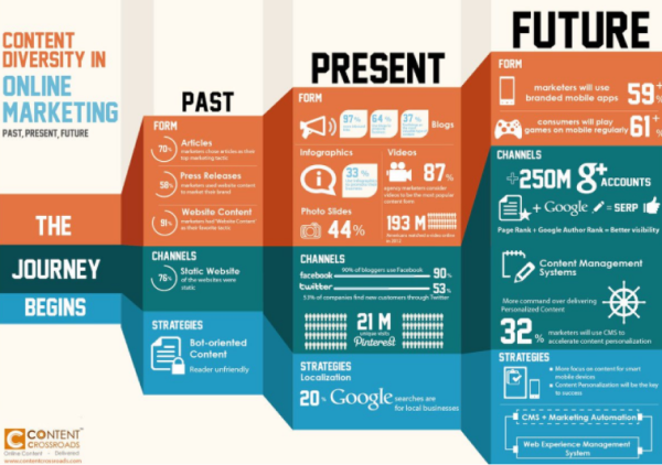
Source: UXPlanet
Another visual trend that is currently gaining traction is neumorphism that has become popular due to its subtle but fresh and innovative look. Marked by minimal and real-looking elements, neumorphism draws on skeuomorphism and 3D design to bring physical attributes like shadows and textures to digital interfaces.
In neumorphic design, it’s all about light and shadows. Designers combine a monochromatic color palette with shadowing to make UI elements appear protruding from the background.
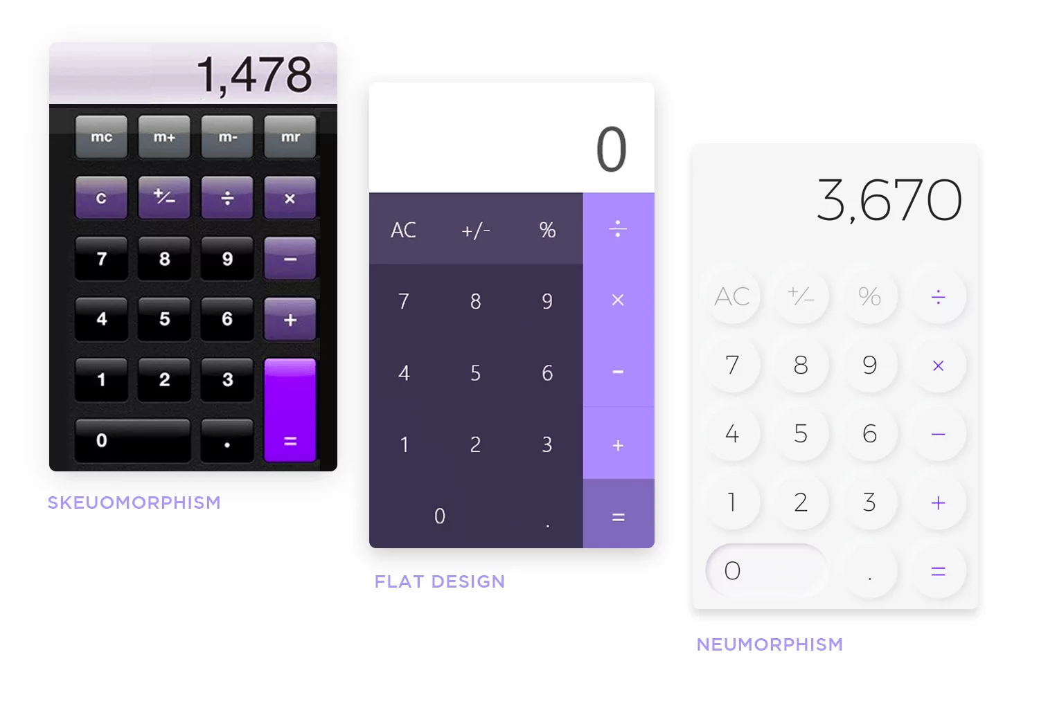
Source: JustInMind
A dark mode is not something new but it’s making a major comeback in 2022. The high contrast provided by a dark mode reduces eye strain and makes texts more readable, which is great for enhancing accessibility for visually impaired users.
In addition, a dark mode reduces power consumption and improves the battery life of mobile devices. This makes implementing a dark mode a good step towards consuming less resources and promoting a more sustainable digital behavior.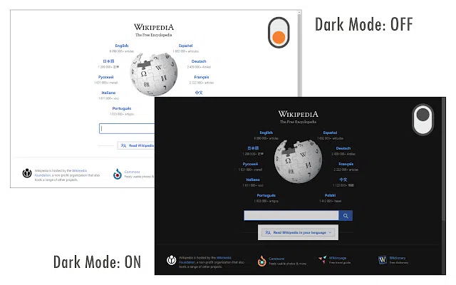
Source: Studio by UXPin
Even before COVID-19, the impact of Alexa, Siri, Google Assistant and the like on UX/UI design was nothing short of astounding. Today, voice user interfaces (VUI) like voice-enabled chatbots and voice assistants are increasingly used to allow users to communicate with apps and solutions only by using their voice, thus enhancing accessibility and improving user experiences.
In addition to voice user interfaces, we will see an increased use of air gesture control features, i.e. the ability of users to control their devices through bodily movements and gestures like swiping, opening the palm, waving, or pinching. For example, Samsung smartphones support gesture navigation and control, allowing users to take hands-free selfies using palm gestures.
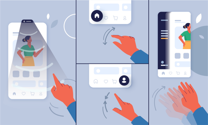
Source: UX Planet
It goes without saying that great UX/UI design is non-negotiable today. Users get the first impression within 50 ms of visiting an app or a website, and if your visual design is not up to the challenge, there will hardly be a second chance to turn things around. The same goes to the way a user interacts with your product — confusing workflows and lack of relevant feedback can easily ruin a user experience.
Staying on top of UX/UI game is important in order to better connect with your customers and make your brand stand out from the crowd in a competitive market. In 2022, the latest UX/UI trends include scrollytelling, minimalism, advanced micro-interactions, dark mode, neomorphism, data visualization, and touchless interactions.


